 Support for eserp 1.5 has been discontinued as of 01.01.2024, the online help will no longer be updated
 Edit eForm templates
The eForm builder opens when you create an eForm template or open one for editing.
The following image shows the user interface:
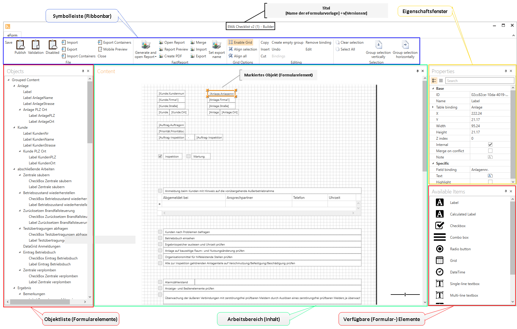
Elements in the eForm builder window
Title bar
The name of the eForm template with the version number and process type are displayed in the title bar.
[eForm template name] + v[version number]
The title bar also displays the version number of the eForm builder

If an asterisk * is displayed in the title bar after the template name, there are unsaved changes in the eForm template.
Toolbar
The toolbar gives you access to the individual functions and actions in edit mode of the eForm builder.

The buttons are arranged in thematic groups.
The buttons in the toolbar are shown in different sizes depending on the screen resolution and the size of the program window.
If there is not enough space to display the button label, a smaller icon for the function will be displayed. The label / function will be displayed as a hint when you hover the mouse pointer over the icon.
The functions provided in the toolbar are described under Functions.
Object lists
The structure of the eForm template is shown as a tree diagram in the object list. Form elements that are placed on the desktop are listed in the object list. Groups and the elements assigned to groups are also displayed.
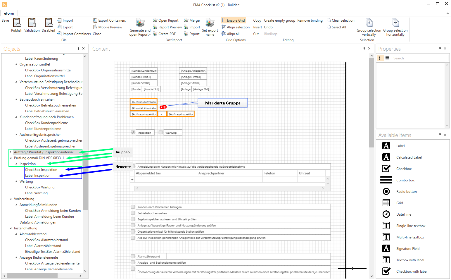
Group management
Groups can also be managed on the object list along with the elements. Groups are logical units that represent interdependencies.
Groups can be arranged horizontally or vertically, also see Link selections (Groupings).
Elements can be organized and interlaced in groups. Because the eForm templates are primarily based on an absolute position system, the position coordinates for the view for filling out the eForm are converted into a relative system. So that the esmobile app, for example, can determine which elements have which dependencies, these groups serve as logical units in a hierarchical structuring of the template.
These groups do not play a primary role in the appearance of the work area.
The image shows that selected elements are indicated by a red anchor  . This means that the elements are connected as a group. A black anchor
  indicates that the elements are not yet grouped.
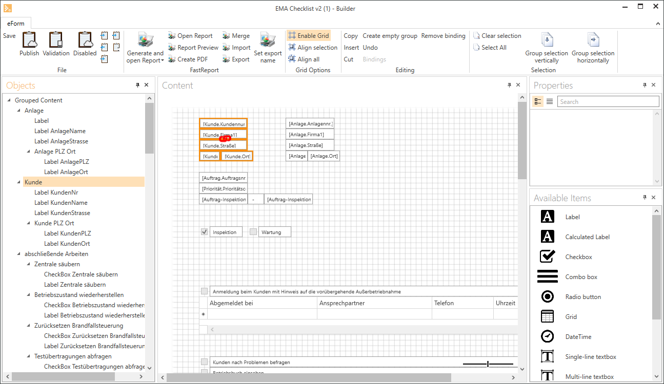
This group is called Client in the example. The Client group contains a further group, Client ZIP City.
You can use the Mobile preview button to get an idea of how the grouping affects the display of the eForm to be filled out.

If you have selected several elements, the black anchor icon is displayed. You can generate a group by clicking on the anchor icon. This group is displayed as a hierarchy in the object list.
Object list functions
You can use drag and drop in the object list or object tree to interlace, select, rename and even delete groups.
Form elements can also be placed in a group using drag and drop.
 Edit objects
Click on the pencil button to change the name of an element or group.
You should assign meaingful names to all inserted elements and groups so that you can keep a clear view, even of extensive eForms.
To check whether a group is linked horizontally or vertically, click on the Pencil button in the Object list.
The Arrange horizontally option is activated for horizontally linked groups in the Rename dialog.
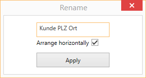
 Unlink
Click on the button after a group name to unlink the group. A security prompt is displayed before the group is unlinked.
Work area (content)
The eForm elements are placed on the work area. Elements can be dragged and dropped onto the work area from the Available elements list.
The order and grouping of elements will affect the appearance of the eForm to be filled out, particularly on a mobile device using esmobile or esweb.
The arrangement of elements made in the work area will only roughly correspond to the final version of the eForm to be completed.
The display will be dependent on the user equipment platform that is used to display the eForm (smartphone, tablet, browser, eForm client).
You can use the Mobile preview function to get an ide of what the version will look like on a mobile device.
A separate FastReport is used for output of a PDF. This can be arranged differently.
An entry is generated in the object list for every element / group on the work area.
If an element on the work area is marked, the properties of the object are shown in the properties list. The properties that are available will depend on the type of eForm.
Adjust size of work area
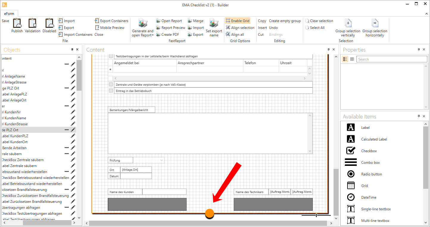
The work area is flexible and can be expanded or contracted by dragging the orange circle. This is shown in the following illustration:
Zoom work area display
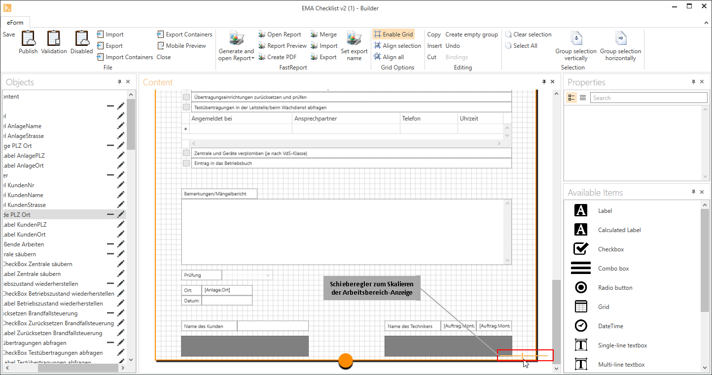
To make it easier to edit an eForm template you can zoom the display of the work area. Use the slider lower right to enlarge / reduce the display.
Properties window
When eForm elements are marked on the work area or in the object list, the element properties are shown in this window. You can edit the element properties in the Properties window.
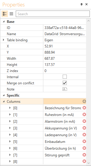
For example, you can move an element with the mouse, or you can set the position by entering the position properties X and Y.
The arrangement of elements made in the work area will only roughly correspond to the final version of the eForm to be completed.
The display will be dependent on the user equipment platform that is used to display the eForm (smartphone, tablet, browser, eForm client).
You can use the Mobile preview function to get an ide of what the version will look like on a mobile device.
A separate FastReport is used for output of a PDF. This can be arranged differently.
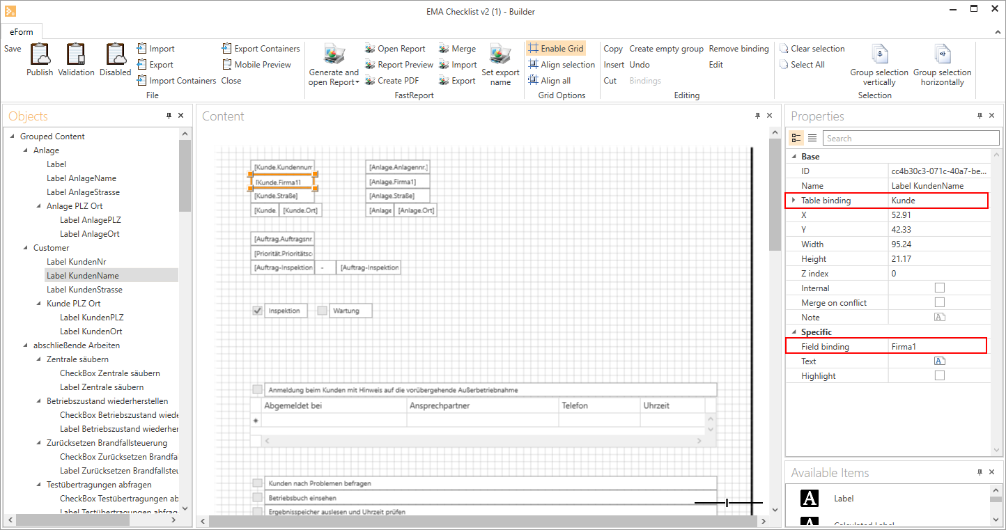
You can link a database table and the associated database fields to an element using the Table link and Field link link fields.
The available table links are given by the selected process type.
Table link / Field link
The following illustration shows that the selected Label type element is linked to the Company1 field in the Clients table.
As an example, you can also further define the columns of the data grid or the available amount of data for the combobox here.
DataGrid (any entry)

This is an example of a data grid with any entry values linked to the Own table. The second column is the Combobox type and allows selection from previously specified values.
DataGrid with table link

In this example the data grid is linked to a table (Table link field)
As well as the selection of database fields (Column name field), entry fields for any entry are also possible (for example checked column)
The numbers in square brackets [ ] indicate the order in which the columns are displayed on the eForm. This order is assigned automatically when the columns are arranged. It cannot be changed.
To change the order, select the DataGrid on the work area and switch to Edit mode (Edit button or F2). You can move the columns to the desired position using the mouse.
You can record a value using the + button. You can delete values using the X button.
ComboBox
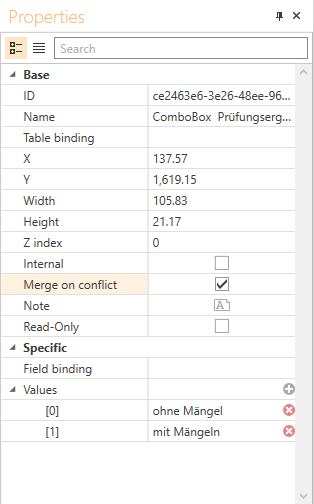
The elements that can be selected in a combination box can be recorded in the Values field in the Specific area.
You can record a value using the + button. You can delete values using the X button.
The numbers in square brackets [ ] indicate the order in which the values are displayed on the eForm. This order is assigned automatically when the values are entered. It cannot be changed.
To change the order of the values, delete the values and enter them again in the desired order.
Other options, such as Internal or Required field, indicate if the element is visible externally (for example to the client) for a subsequent summary, or if it is necessary to fill out a field before the eForm can be completed.
The division into Basic and Specific only means that there are some properties that are common to all element types, while others are specific to the type of element.
If groups are marked in the work area or in the object list, no properties will be displayed.
The name of the element can be changed.
You should assign meaingful names to all inserted elements and groups so that you can keep a clear view, even of extensive eForms.
Available form elements list
The eForm elements that are available are displayed in this list. You can drag the available elements on to the work area and drop them there using the mouse (drag and drop).
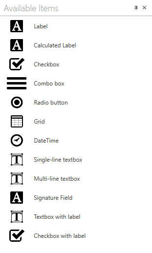
The following elements are available:
 Label
Label
Element for displaying one or more lines of text.
Also display of elements from eserp, for example: Order number.
The text of a label cannot be edited when you fill out an eForm.
Calculated label
This element can be used for calculating values, for example to determine the transitory period from entered values.
You can record the following values for calculated fields in the Specific area of the Properties window:
Field link
If you have selected a database table under Table link in the Basic area, you can use a database field from the selection here.
Text
The actual formula used for the calculation is recorded in this field. You can use values, variables, and constants in the calculation.
The variable names are entered in square brackets [ ].
Entry type
Select the data type for the calculated field. Use the String data type, for example to combine texts. You can use the Numeric data type for calculations using variables.
Make sure that all the values in a calculation have the same data type.
Variables
You can record variables for the calculation using the + button here.
 Checkbox (option)
An element that can have the status active or inactive.
 Combination box
An element that can take a value from a defined range of values. You can record the values in the Values field in the Specific area in the Properties window.
 Radio button
The radio button element allows you to provide several values for selection in an eForm, where normally only one value can be selected.
This restriction can be removed using the Multiple selection option in the Specific area, so that more than one value can be selected.
 DataGrid
A complex element that represents a table. Static data (for example manually entered values) or dynamic values (from a database, for example) can be recorded in it.
Tables that are not linked are static. The number of lines in the table must be specified in advance. If the number of lines needs to be changed later, the previous DataGrid must be deleted from the report before combining the tables.
 DateTime
A variable date field (time not currently supported).
 Single line TextBox
A text field where one line of text can be entered. The text can be edited.
Multiline TextBox
A text field where several lines of text can be entered. The text can be edited.
Signature field
A field that is filled out with a signature when executed.
If the Editable later option is activated when the eForm is created, a signature field cannot be inserted.
TextBox with label
A combination element
It contains a horizontally arranged group comprising a Label and a Single line TextBox. Makes it easier to show labeled entry fields.
Checkbox with label
A combination element
It contains a horizontally arranged group comprising a Label and a Checkbox (option).
Makes it easier to show labeled checkboxes.
You should assign meaingful names to all inserted elements and groups so that you can keep a clear view, even of extensive eForms.
Docking
The program elements below the toolbar can be dragged with the mouse and placed / docked onto certain main points on the title bar.
Your customized arrangement of the program window (docking) will revert to the original state when you close the eForm builder.
 Docking functions
Undock window
To undock a window, click on the window Title area, hold down the mouse button and move the window as required.
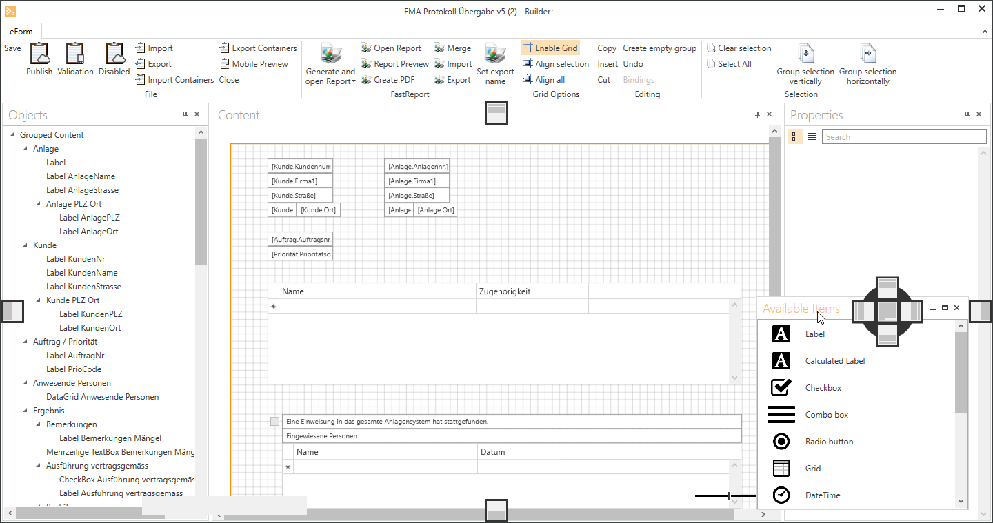
This undocks the window, which is now a separate window on your workspace.
All the other docked windows will automatically adjust to fill the space freed by undocking the window.
Dock window
To dock a window click on the Title area and drag it on the screen until the Docking Icons appear (Shown outlined in red in the screenshot.
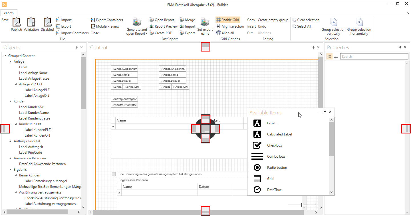
At this point, the window can be docked at the edges. If you now drag the window on to one of the icons, the area is highlighted in color.
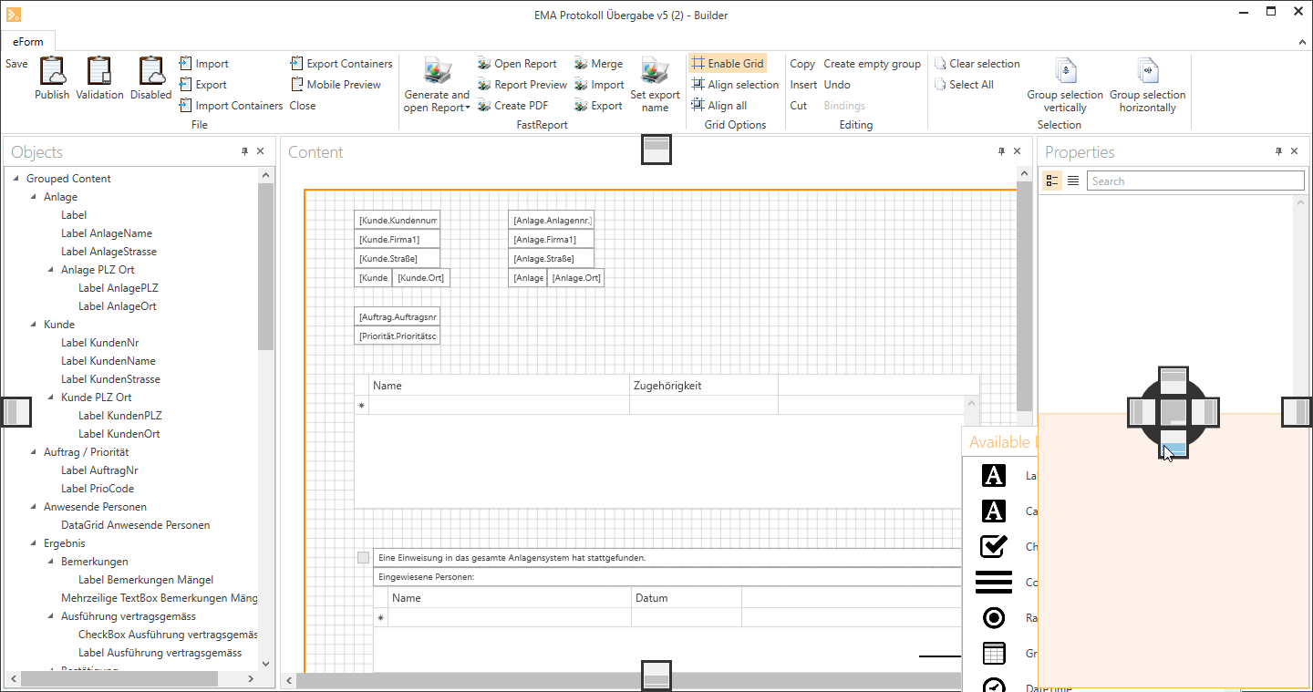
The shaded area indicates the area where the window will be displayed when you release it. All the other windows will be rearranged when you do this. Windows can also be docked within other windows.
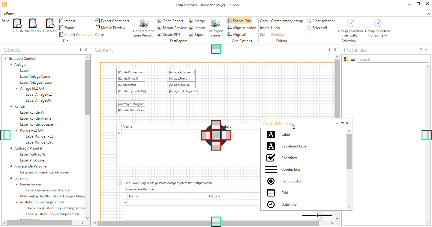
The docking icons outlined in green here are the main docking points, which were explained in the above example.
The docking icons outlined in red are used to arrange two windows together on the same area. The windows can be arranged one below the other or side by side according to the icons.
Generally, every window can be docked on to other windows.

Docking bar
The outer icons indicate the side where the window is to be docked. The area is highlighted in color as described above.
The icon in the center indicates that a window is displayed together with another window in a separate tab. This tab is created automatically.
Additional docking functions
Create tabs
As it can be quite complicated to organize lots of modules (windows) on the workspace, there is a way to organize several windows in the space of one window. These windows are organized as tabs.
If you want to link several windows together in this way, set the window to Docking mode (click and hold the window) and drag it on to the center icon of the  Docking bar.
The whole area is now highlighted, and when you release the window, both windows will now be shown as tabs.
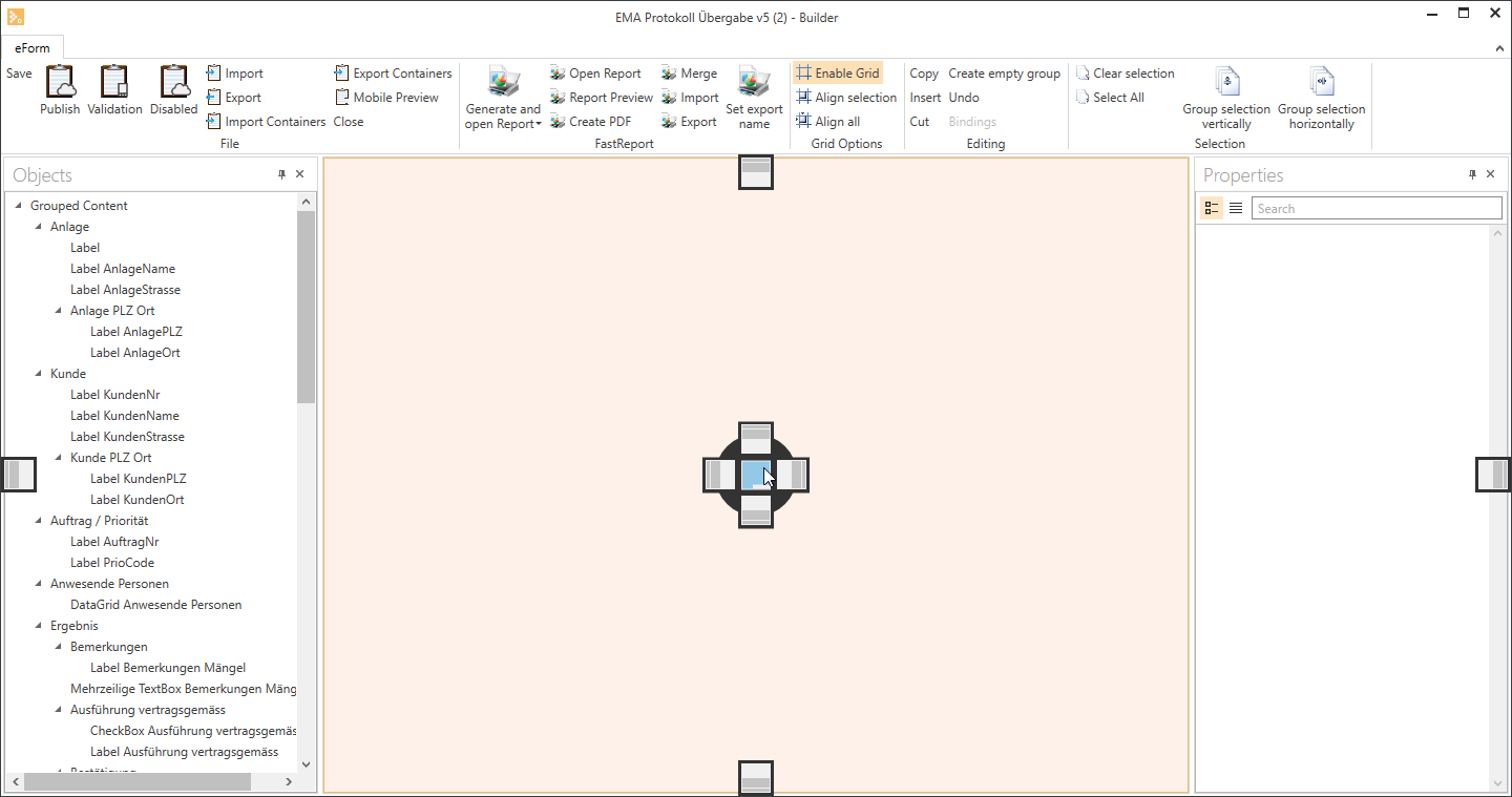
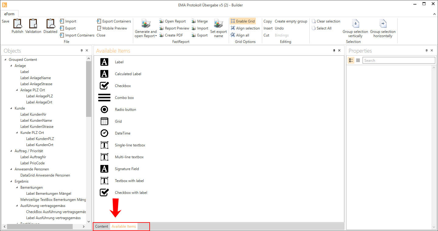
You can switch from one tab to the other by clicking on the tab you want. The active tab is brighter and is connected to the window.
If you want to separate a tab from a window, click and hold the tab and drag it in any direction.
The tab is released and is now displayed as a separate window again.
Hide / Auto hide
Another way to organize lots of windows and modules is to hide them. This means that windows are not always displayed.
Every docked window has a pin icon  in the top right corner.
When the pin is vertical, the window is displayed permanently. To hide the window, click again on the pin icon.
The window shrinks to a small tab that is shown on the edge of the workspace.
If you now move the mouse pointer over a tab, the hidden window will be displayed on top of all the other windows without changing their positions or sizes.
If you click on the horizontal pin icon  , the window will again be displayed permanently on the workspace.
The tab bars are displayed on each side of the main docking window. The position of each tab depends on where the window was placed before it was hidden. This means that windows near the top will be hidden at the top, those on the right will be hidden on the right, and so on. You can, however, move these tabs to a different position. Click and hold the tab and drag it into one of the other tab bars.
Customize window size
Docking means that several windows share the same workspace. Each window is set to a calculated size.
Since some windows need more space than others, you can change the sizes of the windows if required.


To change the size, move the mouse to the division between two docked windows until the double arrow pointer appears (vertical  and horizontal
  arrows are both possible).
Click and hold the mouse button and drag in the direction of the arrows to increase or decrease the size of the windows as required.